Importance of Mobile Friendly Websites
I was traveling on the train when planning this post.
Browsing the web, doing some fact-checking on my phone.
I looked up and saw at least 20 other passengers all staring at their mobile.

In the last 10 years, the rise of mobile has triggered a seismic shift in how we consume content.
A 2017 report by CDN provider Akamai shows that:
- Over 56% of online sales traffic over the holiday period, was on mobile
- Mobile devices also had the highest conversion rate growth with 71% on Black Friday
- The Mobile bounce rate was 50% (Ouch!)
That was 2 years ago.
Statista has predicted the future of mobile. Usage is set to increase sevenfold between 2017 to 2022.
The web has been on a huge push over the last 5 years to be mobile-friendly.
At first, companies had two sites one for mobile and one for desktop. Then the responsive design movement started.
The responsive design allowed a way of building a website once that would fit on any device.
Finally, we could build a desktop site that worked on mobile.
To test everything was working, Google created a tool so that we could check that we were mobile-friendly.
Mobile-Friendly Test
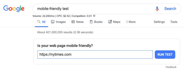
They even made it easy to find.
Googling “mobile-friendly test” would present a handy text box to enter your URL.

Try it now, enter your URL and hit the “Run Test” button.
Once it has analyzed your webpage it will let you know if it has passed.
Google then analyzes your webpage to make sure it is mobile-friendly.
To decide if the site is mobile-friendly Google uses these criteria:
- The website fits the screen
- Googlebot can see the page and content
- The website avoids common mistakes that affect mobile users
This last criterion is a bit vague so let's break this down:
The common mistakes:
Fonts
The fonts must be easy to read when on mobile. As a rule of thumb, make sure that the font never goes below 11pt.
Buttons / Links
So that users do not tap on the wrong part of the website, there must be enough space around the button or link.
Keeping an area of 44px by 44px will allow the user to hit the button they were expecting.
Screen Size
Here they are checking that the content fits the width of the page.
Have you ever been on a desktop site on your phone?
Chances are you have. It's annoying, right?
You have to scroll around and pinch to zoom.
To fix this add the viewport tag on the page. It’s simple to do, like this:
<meta name="viewport" content="width=device-width,minimum-scale=1">
Page Speed
Pages that are slow on mobile get flagged as not mobile-friendly.
Links to Desktop from Mobile
Less common now than it used to be, this is when a mobile site links to a desktop page.
This is a poor user experience and also flags as not friendly.
Pop-Ups
We are talking about full-screen annoying pop-ups, that ask you to “download our app” and take up the whole screen.
The mobile way to handle this is to have a banner at the top or bottom of the page that the user can dismiss.
Desktop only Content
This is again less common these days but was very common in the days of flash. Flash videos would not work on mobile and this was also flagged.
If the site passes these criteria then Google will class your site as mobile-friendly.
<img style="max-width:428px; margin: 0 auto"src=”/images/importance-of-mobile-friendly-websites/passed.jpg” alt="mobile-friendly Pass">
Yay!
Is that enough?
A Mobile-Friendly Website is not Enough
I would argue that it is not enough to be only mobile-friendly.
If we trust the data and look at the trends. We can see that mobile browsing is going to increase over the next few years.
This has prompted the mobile-first movement.
Google has been making a subtle transition over the last 2 years to mobile-first and we should all be taking note.
Google Transitions to mobile-first
Google tools have been desktop-focused. These have transitioned to mobile.
Recently, it was announced that Google Search Console would add mobile-first indexing.
If you have not done so, I would strongly suggest that you take a look at the Google Search Console and see if your site is using the mobile-first indexing.

The move is part of Google's shift to promoting mobile content first, rather than desktop. It is in Google's interest to offer the best experience to its customers.
If the customers are using Mobile then Google needs to follow.
Google look's at PageSpeed and this effects where you appear in search results.
The Google tool PageSpeed Insights has set the default tab to mobile, after doing a search.
Google is pushing it's technology Accelerated Mobile Pages (AMP). The technology enforces development practices that are built for speed.
Google is focused on mobile.
How can you ignore that?
If you care about:
- SEO
- Customer experience
- Conversion rate
Then adopt a mobile-first mindset.
Mobile-First Mindset
What is a mobile-first Mindset?
When we are designing websites you need to think about mobile users interact. This subtle shift has an effect on what to build.

Here are some of the top areas to focus on:
Smaller Screen
Design your site so that it works on a smaller screen. This means:
- Optimized images that fit the screen
- Banner ads, no full-screen popups
- Width set correctly
Think about how you can improve the site for thumbs, not a mouse and keyboard.
Network Speed
Most mobile users are going to be on slow 3G networks so be sure to take note of your page weight.
Use the techniques we discussed in Web Performance Budget to keep the weight down.
Page Layout
Using whitespace so that user's not get overwhelmed with lots of text copy.
Larger Buttons
Replace links with Buttons.
Buttons on the screen are easier to tap.
Readable Font
Use a font that is easy to read on mobile devices.
Optimize it so that it downloads quickly.
Wrapping Up the Importance of Mobile-Friendly Websites
Customers are moving to mobile.
This trend will continue until 2022 and beyond.
At a minimum, you need to be mobile-friendly today.
However, take note of what Google is doing and start thinking about mobile-first.
A mobile-first mindset means you are addressing mobile concerns from the start.
Building fast, performant and well-designed pages will make your website a success.
